Branding
This collection features visual identity systems built on deep research, balancing creative look and feel with real-world constraints. Whether navigating strict packaging rules or capturing collaborative, era-specific themes, these projects show a versatile approach to intentional design and storytelling.
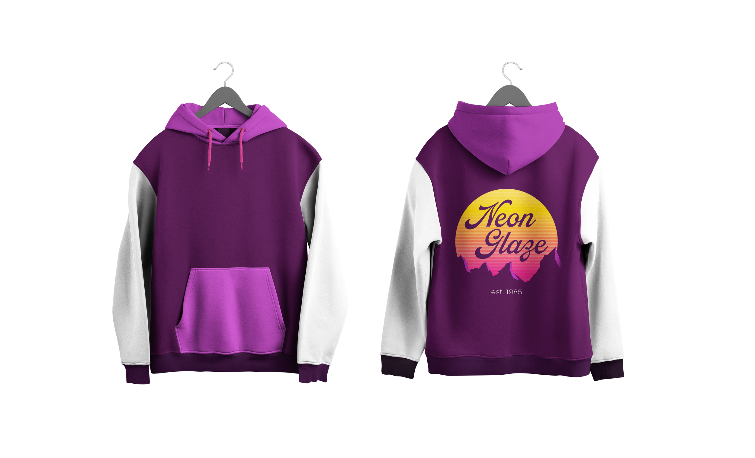
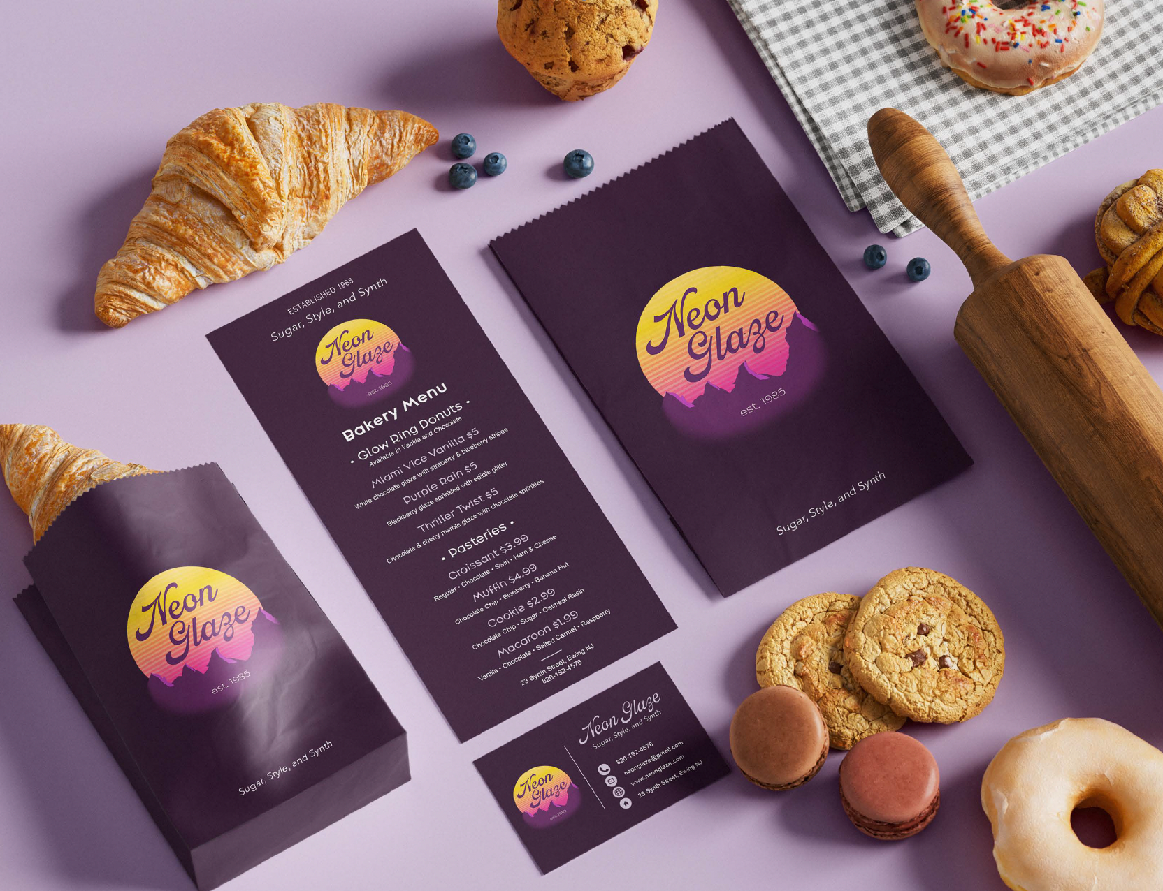
In the Spring of 2025, a classmate and I were assigned to make a common place of interest with a randomly selected time period. We have received "90's" and "bakery," and we looked online for some inspiration, which led us to a neon mountain over a pink-and-yellow gradient sun with a horizontal line grid — the visual shorthand of the decade. This project refined my skills in collaborative branding, aesthetic research, visual identity systems, and applying historical influences to contemporary design.
Neon Glaze
In 2024, I was assigned to create packaging for a fictional regulated product packaging brand. The goal was to design it in a way so that the warning labels and information would be properly shown and not hidden behind the design.
Starry Haze
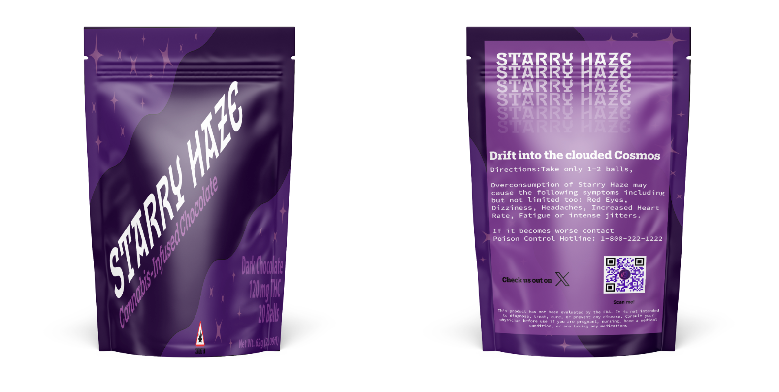
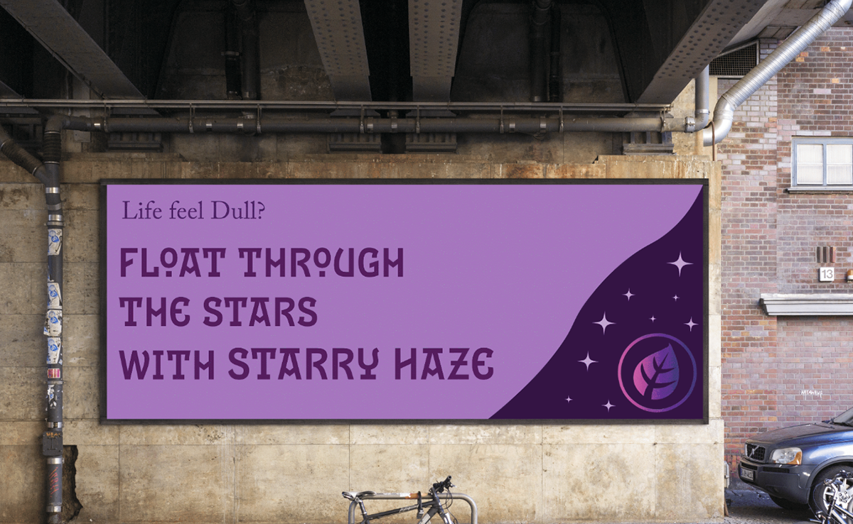
I wanted to research and take a hard look at how alcohol and chocolate brands handle the regulatory vs. aesthetic tension, making sure that when people read my packaging, they know what they are getting into, with the bright words of "Cannabis-Infused Chocolate" and the THC warning label. I chose a cosmic look: like scanning a starry sky, trying to focus pulls your eye into a pleasant haze — a nod to the product without hiding the mandatory “Cannabis-Infused Chocolate” label and THC warning, as when you look up into the starry sky, sometimes trying to focus on some of them can make your vision hazy.
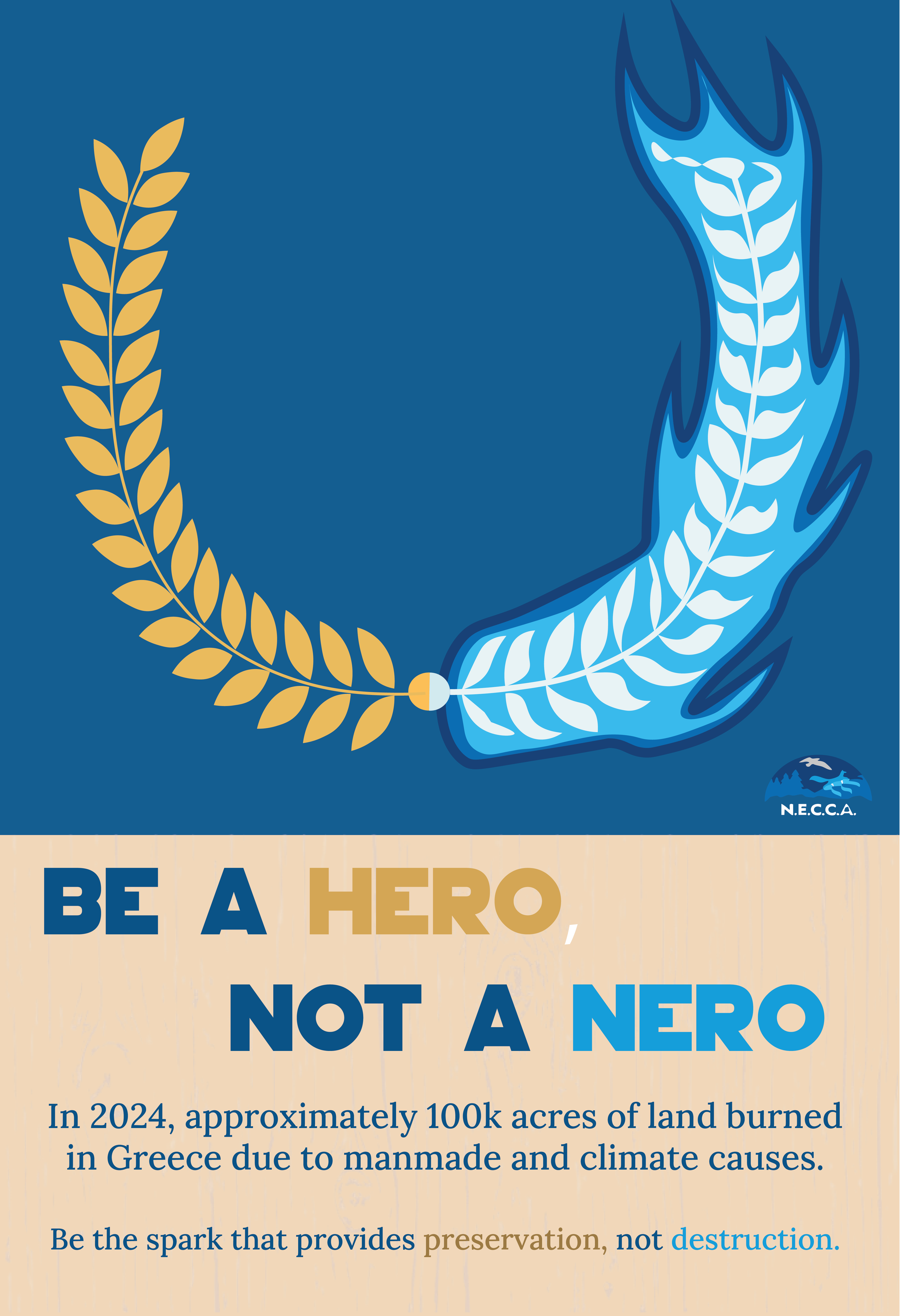
In the spring of 2025, I was tasked with creating a poster to combat an issue for the country to which you were assigned. I wanted to cover the issues of the environment, so I decided to design my poster on the wildfire in Greece.
For a poster addressing an environmental issue, I focused on the wildfires in Greece. The image is a laurel wreath — a classical symbol of honor — split down the middle: one half gold and intact, the other consumed by blue fire. The wordmark carries the same split: Be a Hero, Not a Nero. Nero, the emperor said to have watched Rome burn, anchors the warning — most wildfires start by accident, so caution is the heroic act. Prevention is the heroism.
The non-burnt side of the wreath, which is gold, has the same color as the word hero, while the Nero part of it is blue. Nero is a Roman Emperor who burned his whole empire in a night. I want it to be something like Be a Hero by being cautious, because you could have inadvertently caused a wildfire as Nero did.