Corporate Design
*
Corporate Design *
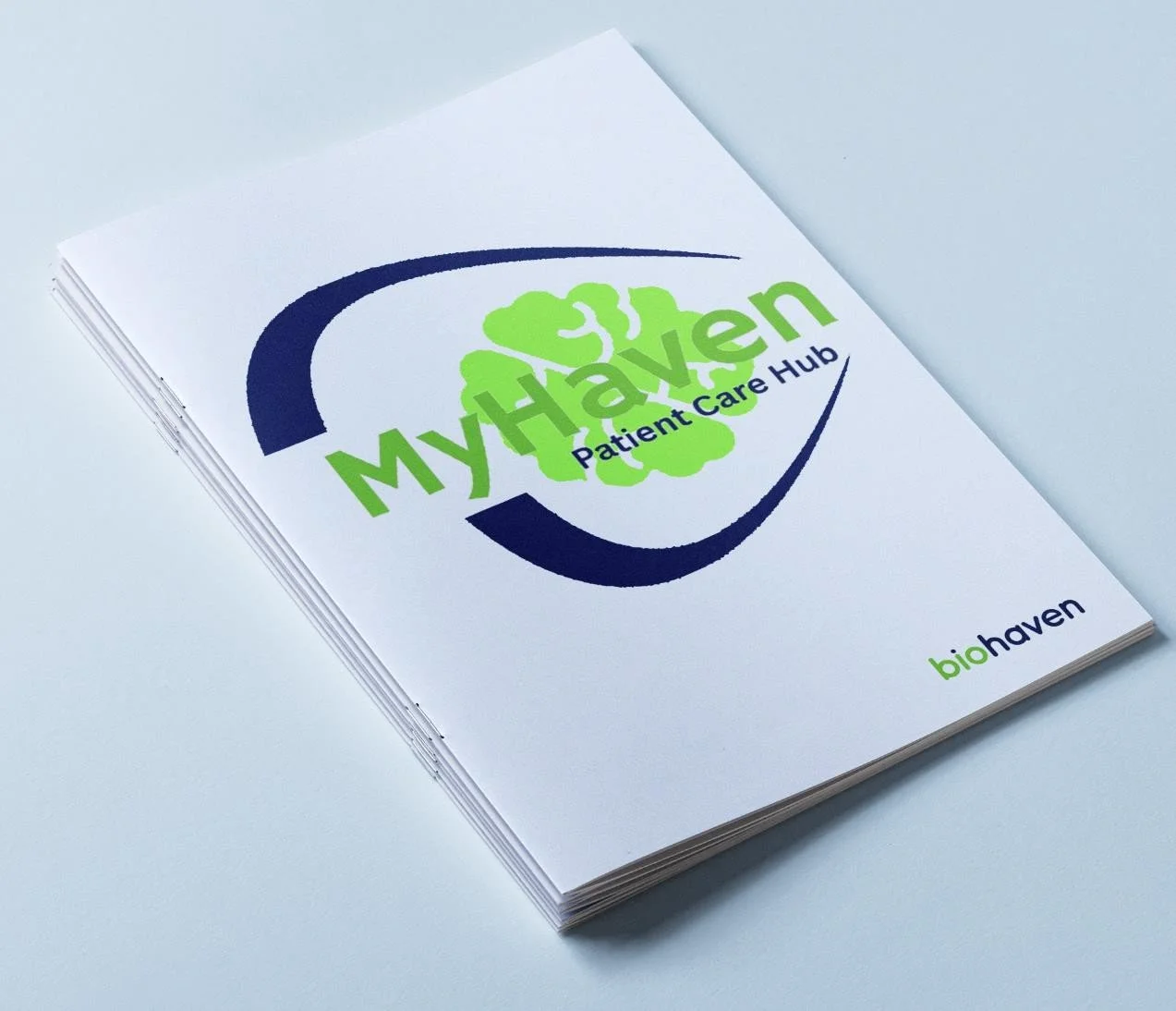
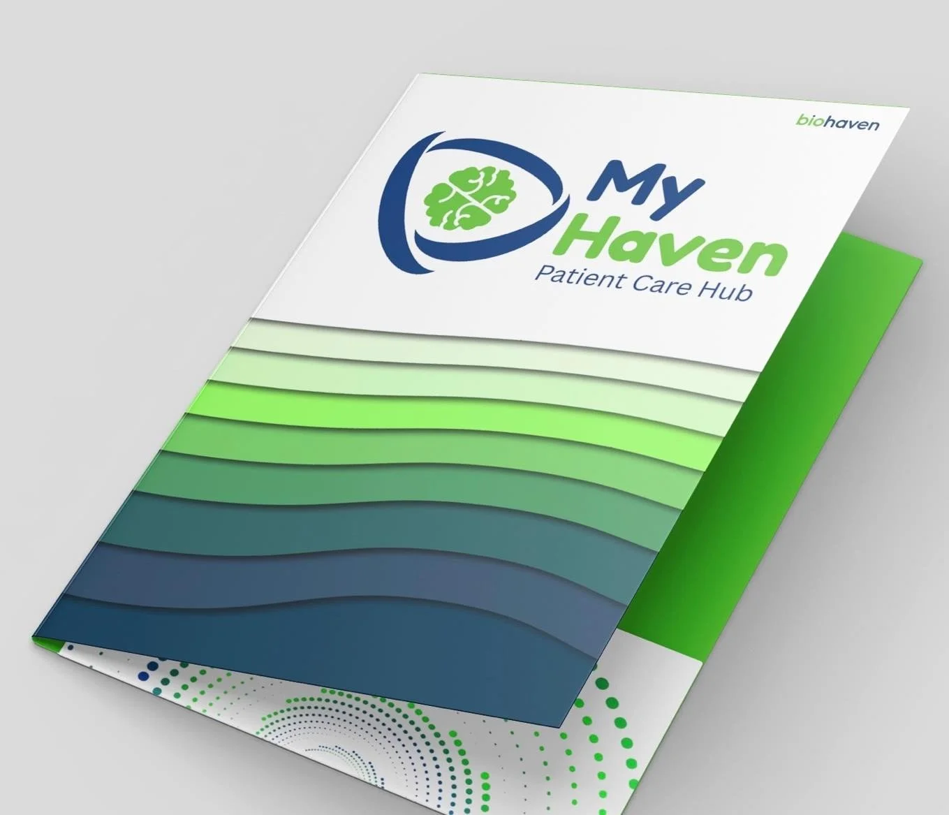
Biohaven was launching a patient-care website for people who were diagnosed with SCA or Spinocerebellar Ataxia. This website is to be used by the patients, the caretakers, and clinicians who want more information about the disease. The brand needed to be something of a warm place where viewers could interact and learn more about the page, the logo should feel warm and inviting, as the people who are viewing the site most likely are not in the best of places.


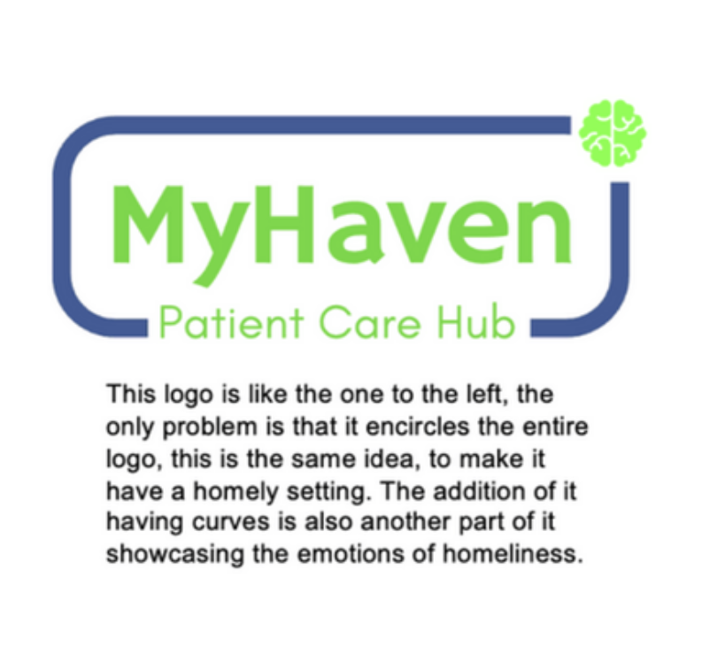


I started by reading the patient journey, what the patient goes through, and also the whole disease overall, and the stages of the illness. After gaining a basic understanding of the illness at hand, I went around my office brainstorming ideas for what the logo should look like.
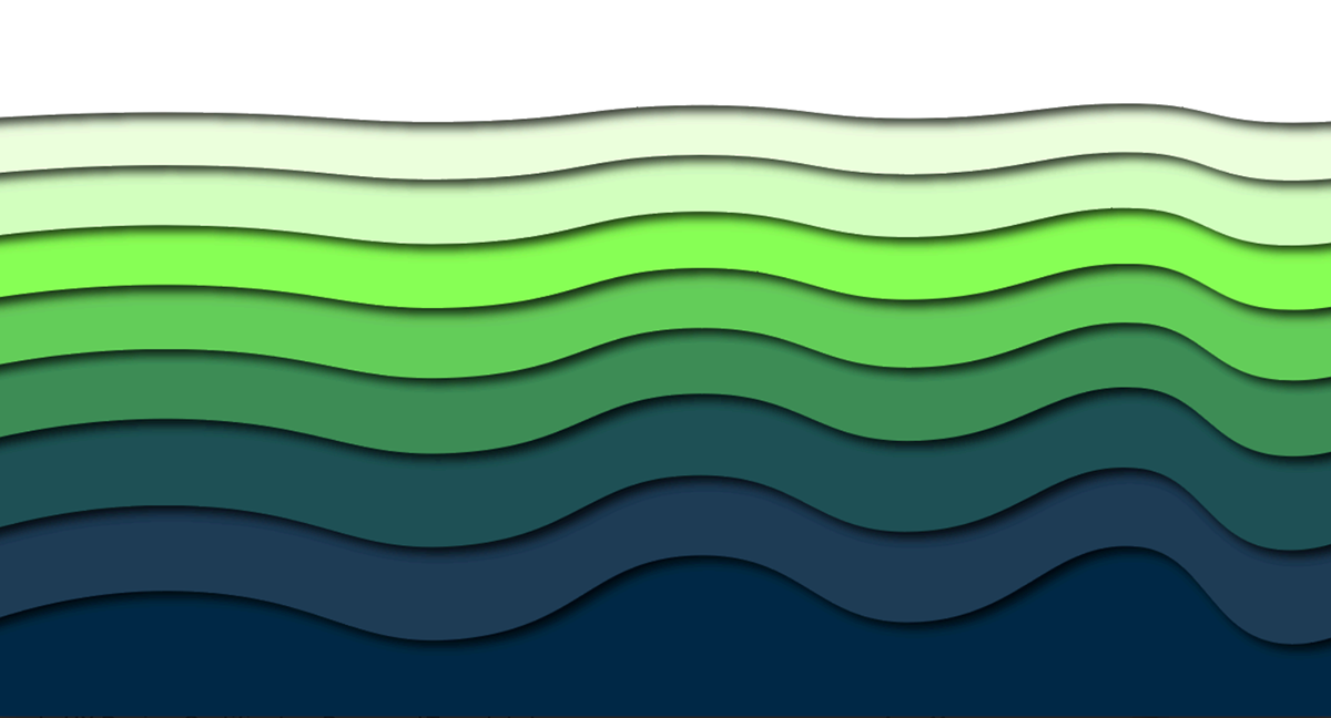
During my internship at Biohaven, I was tasked with expanding the company’s visual library for executive and internal presentations. While they already had a foundation of assets, the team needed a more robust set of custom, branded backgrounds to keep their decks engaging and professional.
I designed a series of high-quality backgrounds that strictly adhered to Biohaven’s brand guidelines while providing enough variety to suit different presentation contexts